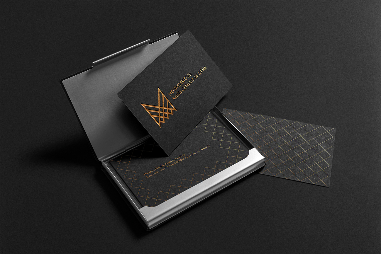
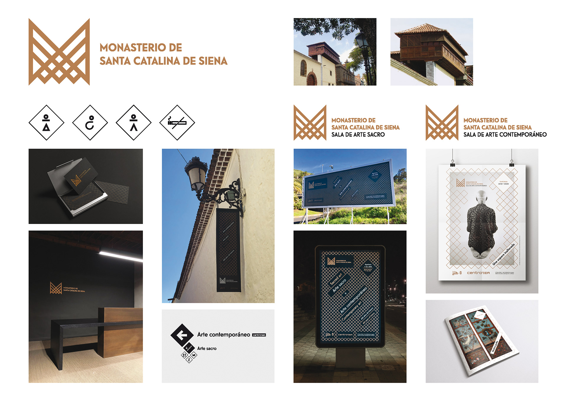
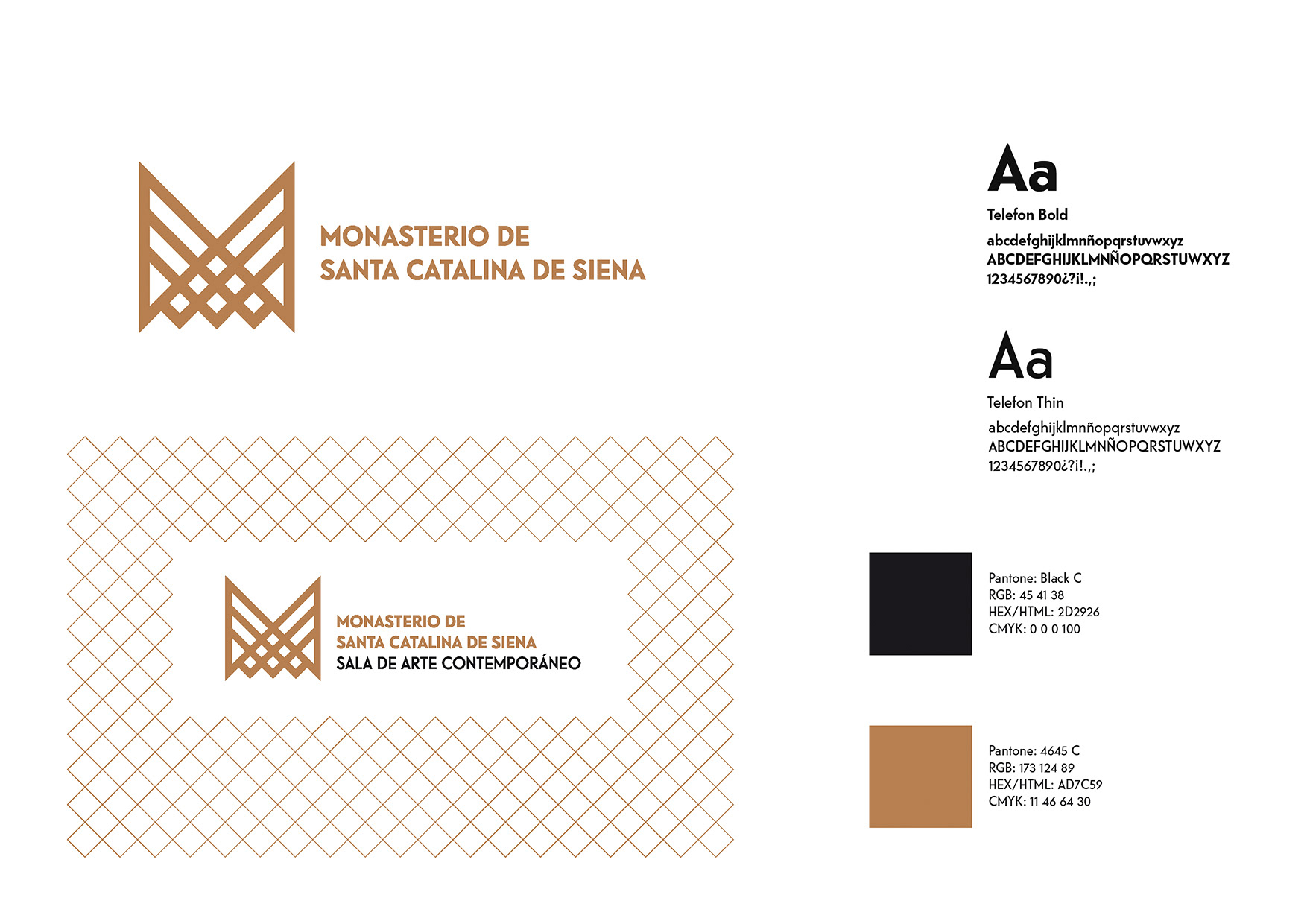
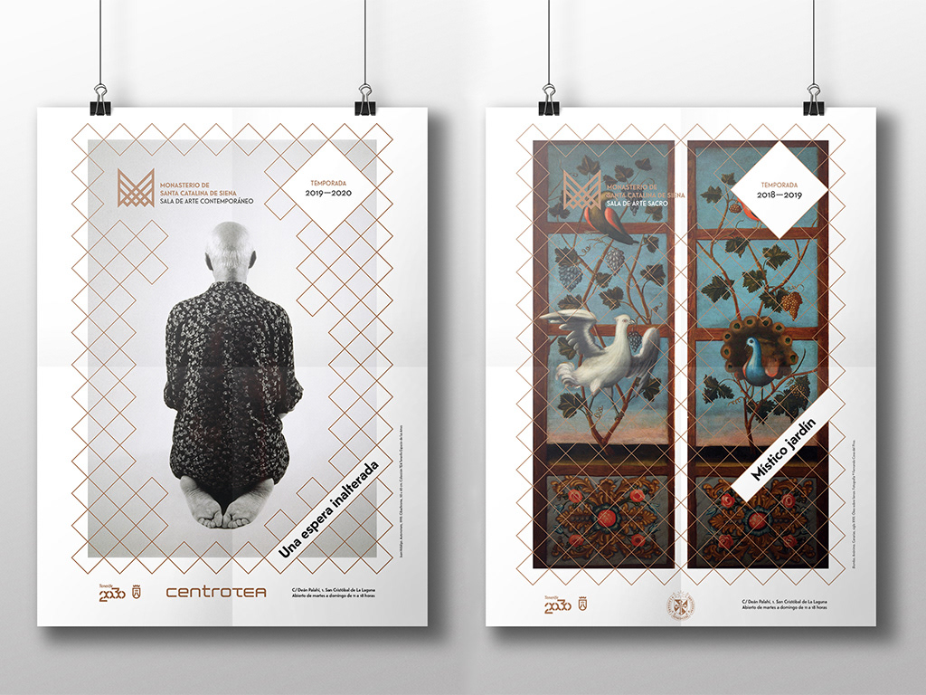
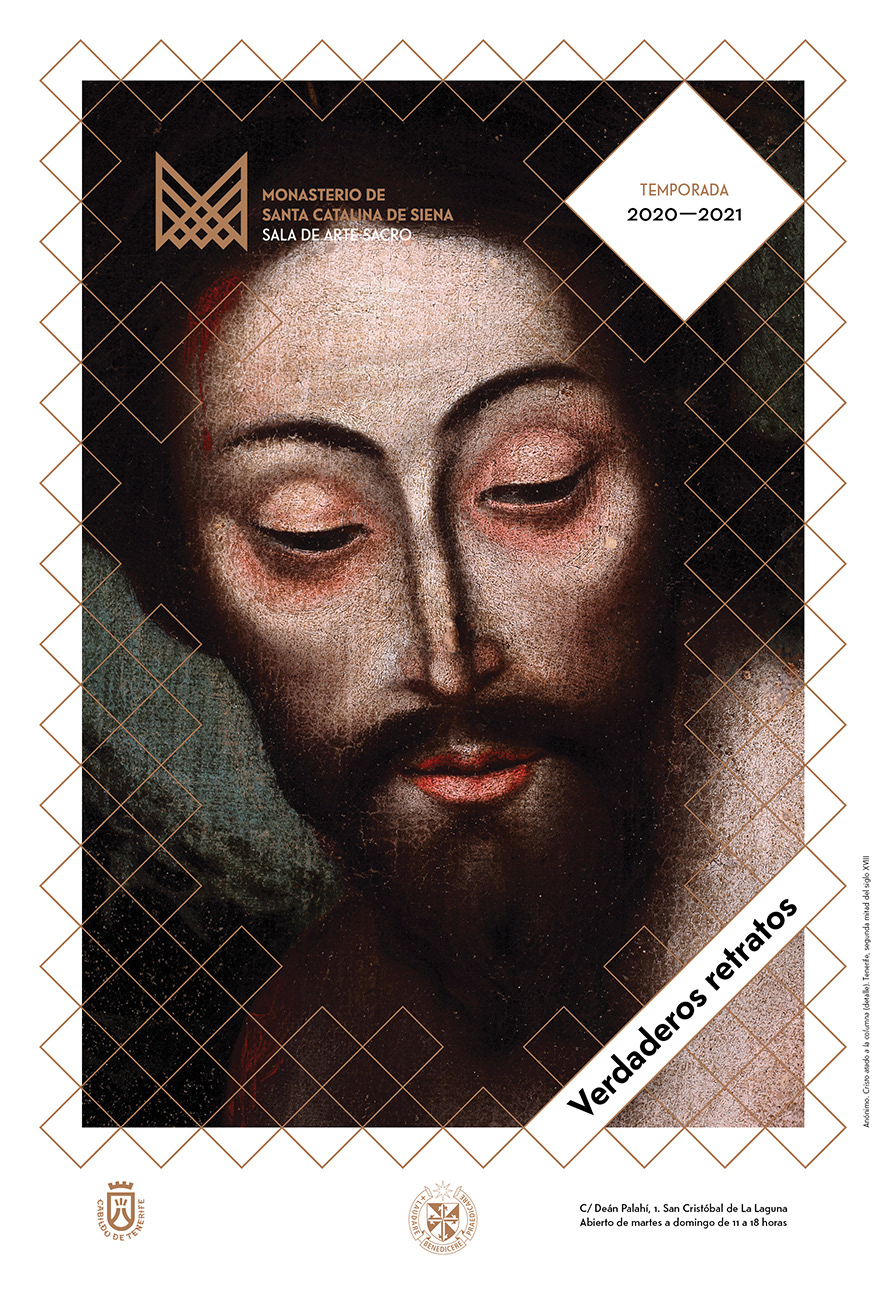
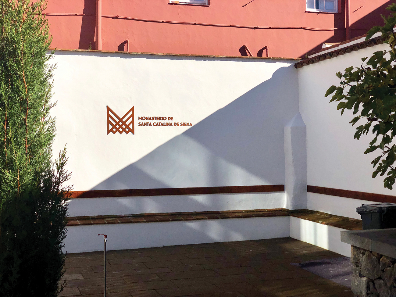
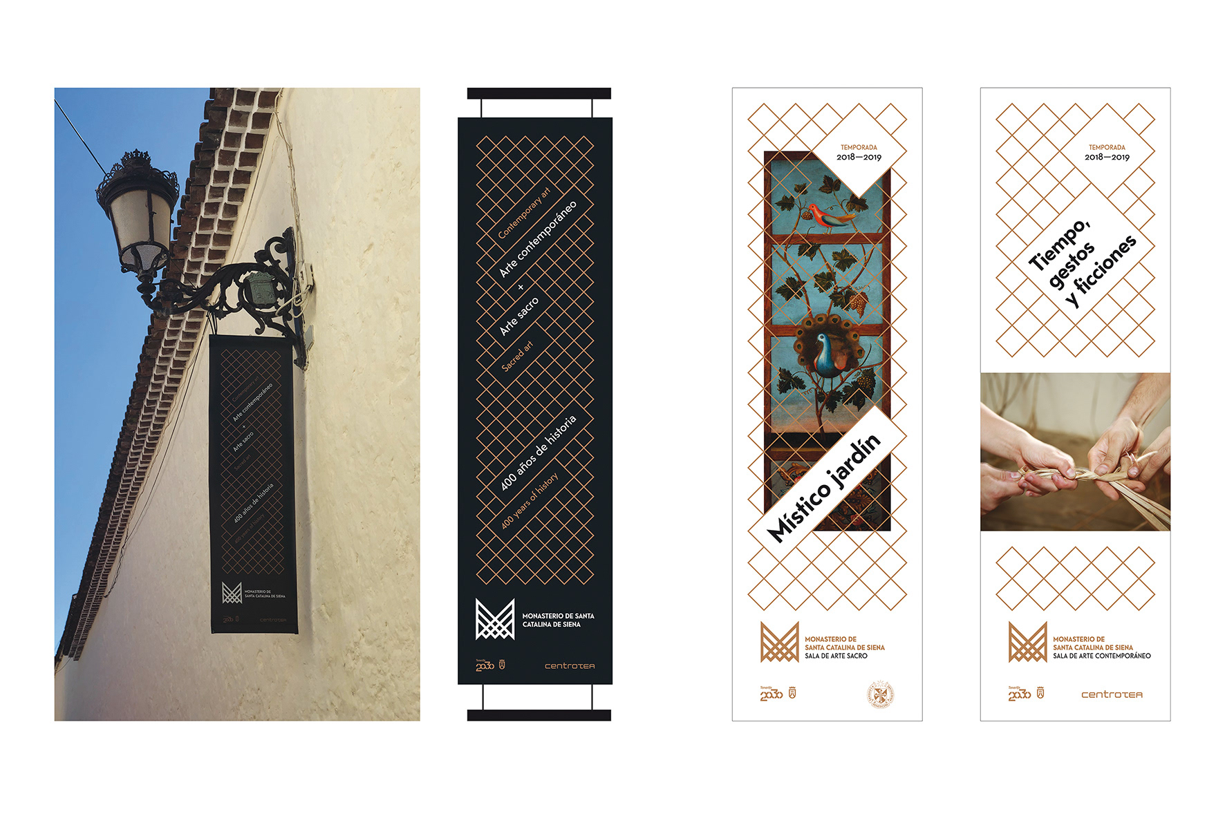
The poster design to announce the exhibitions of the Monastery is based on a grid structure of diagonal lines that makes us think of latticework. A changing visual system, which adjusts according to whether it is contemporary or sacred art. The system adapts to each theme and serves as a template for matching images and texts in a dynamic way.
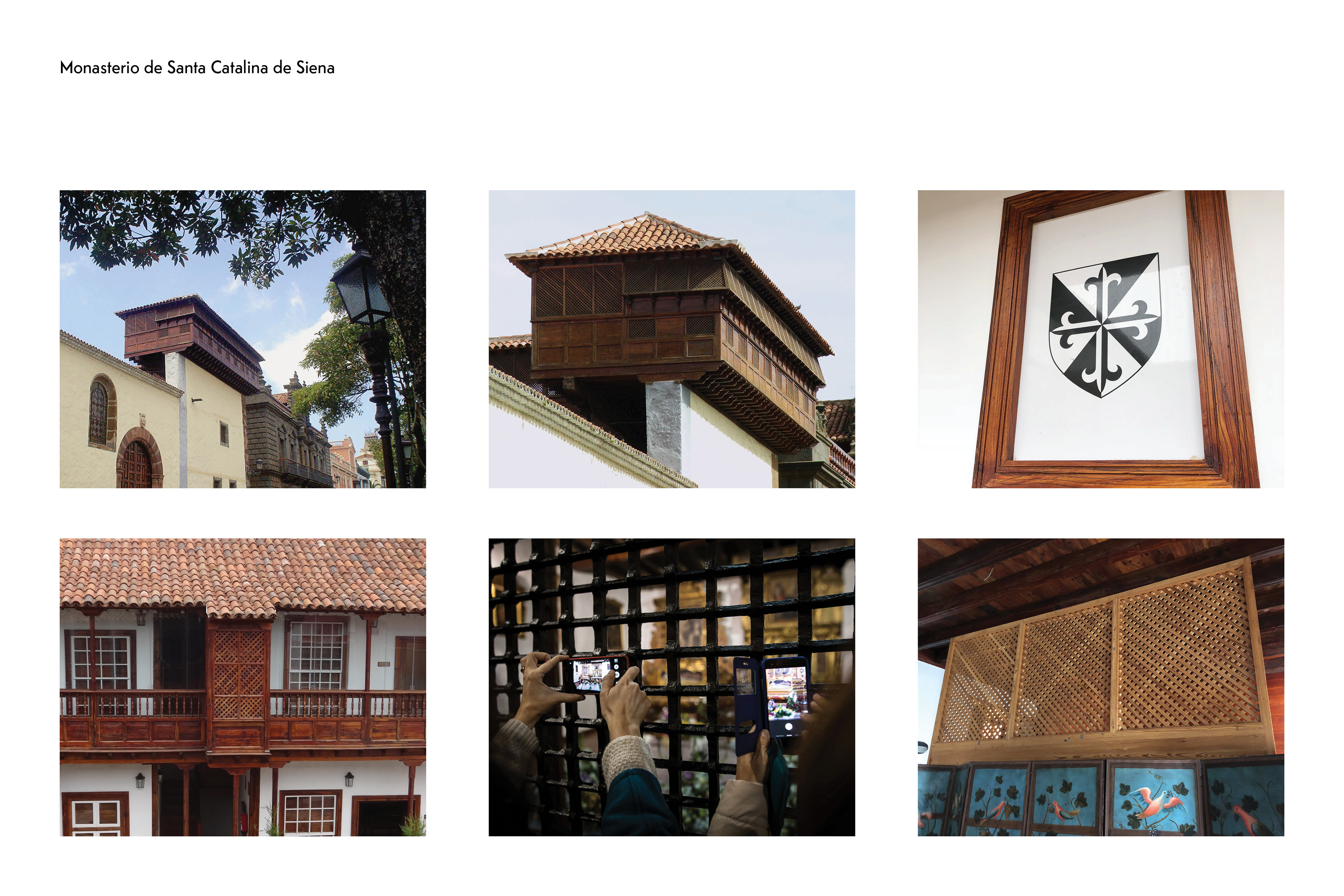
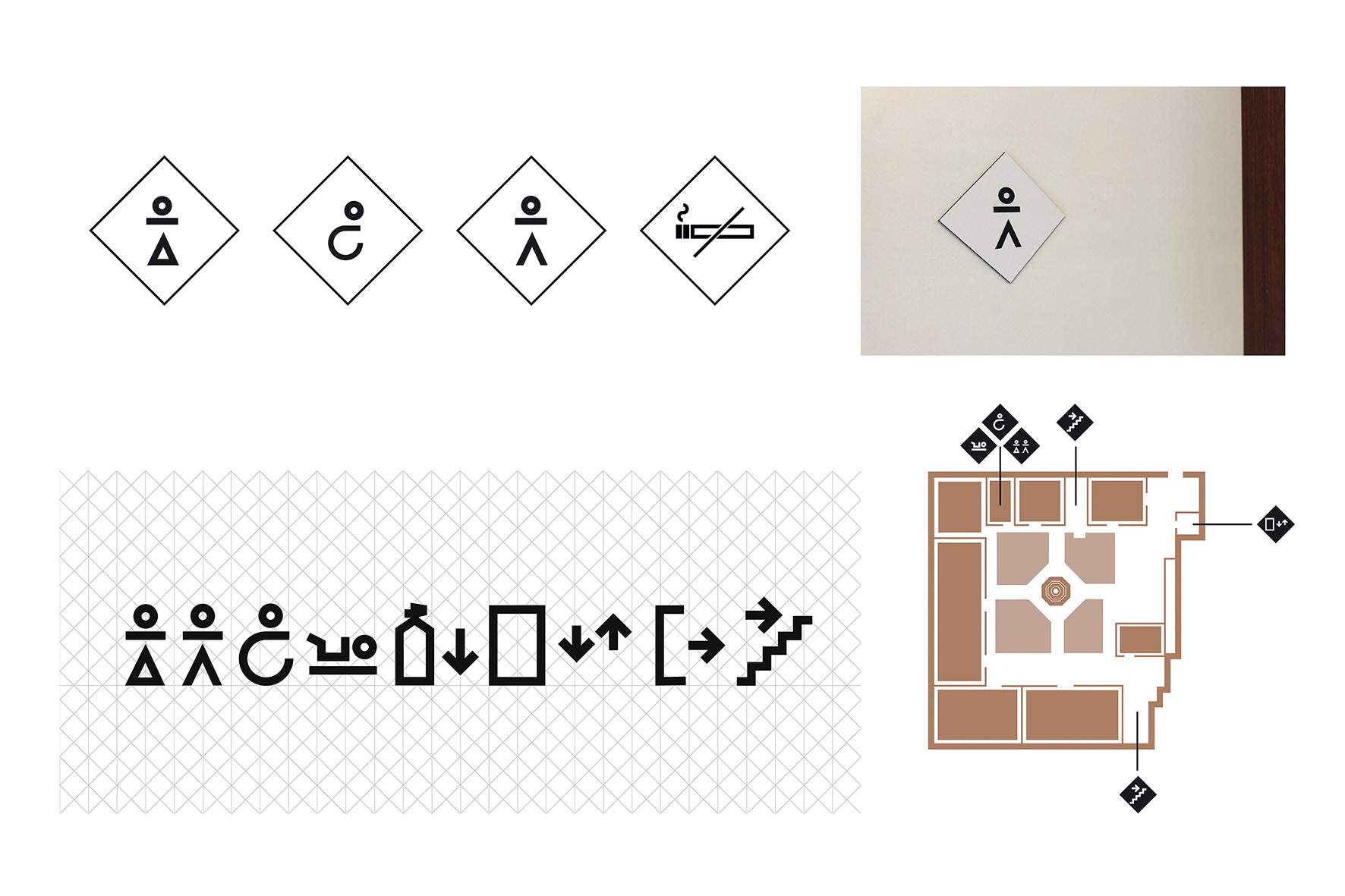
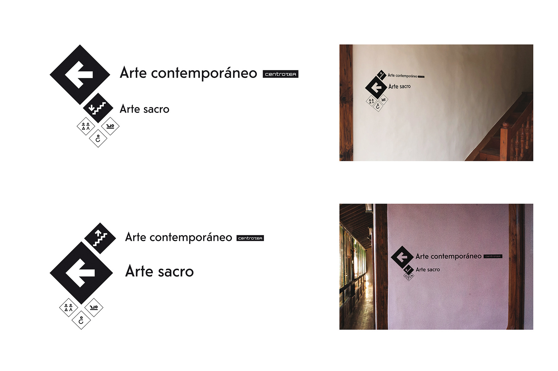
The signage system within the Monastery is also rooted in the same idea and the icons of the pictograms were drawn on a grid of lines with an emphasis on the diagonal and the hierarchy of information increases proportionally with the size of the rhombuses.
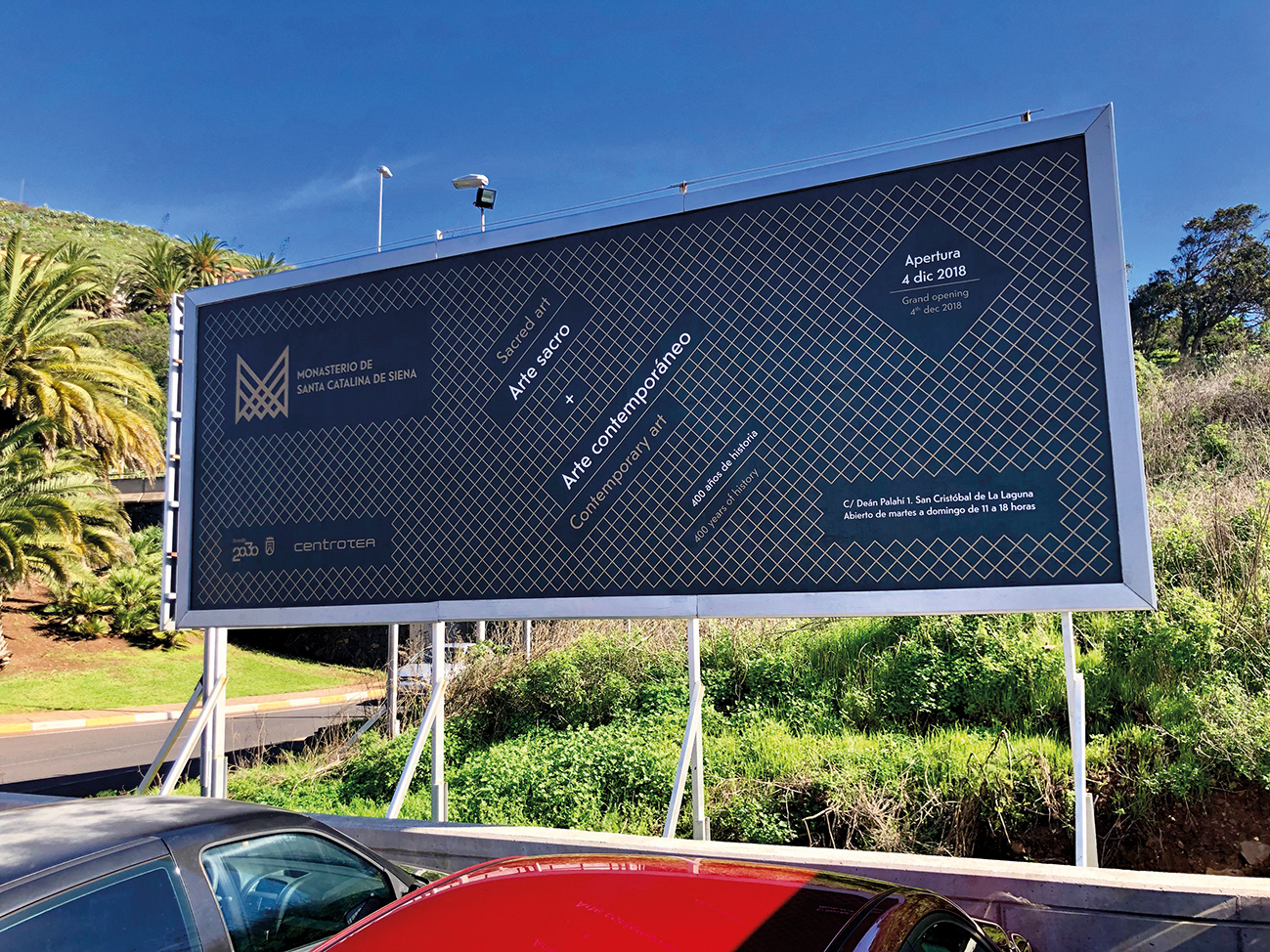
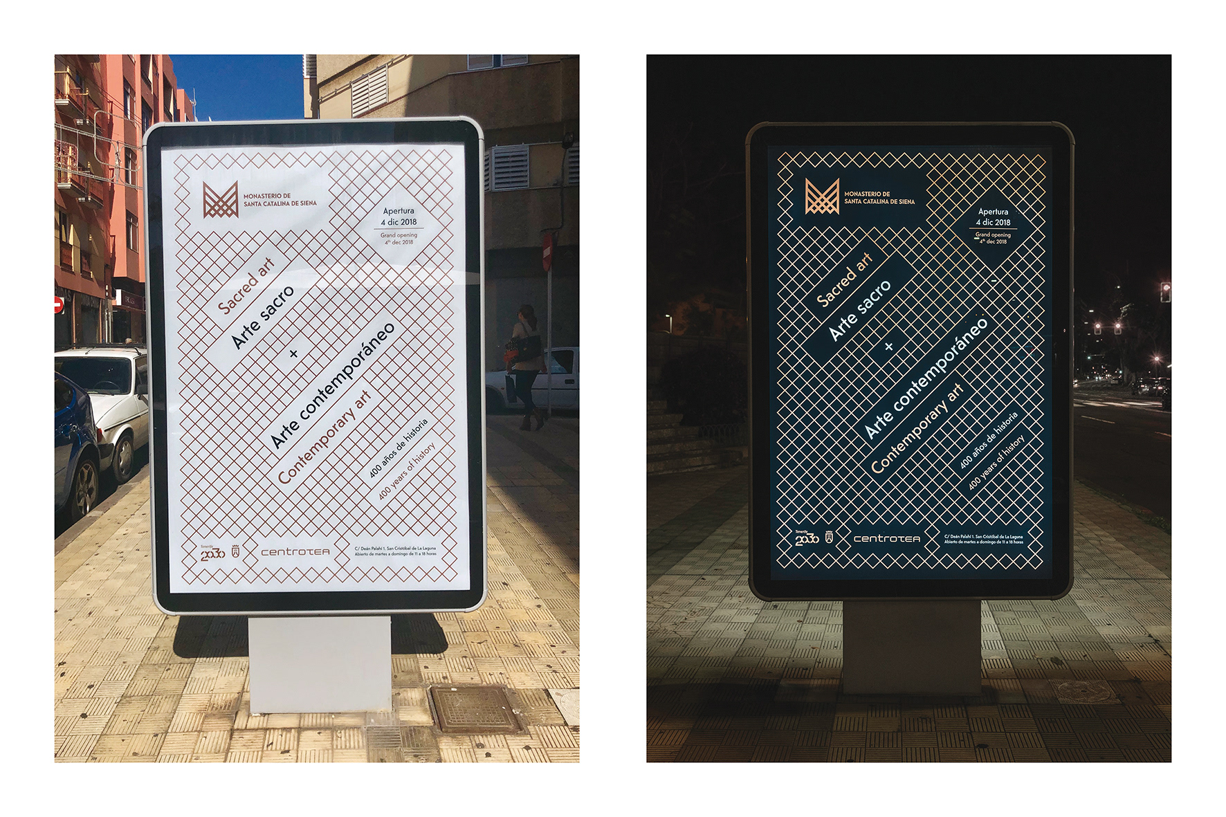
For the inaugural campaign and in order to capture the interest of the general public and tourists with an interest in art, a claim was sought: ‘400 years of history’ and we designed a series of advertisements and posters playing with the basic elements of visual identity.
Awards:
Selection BID 20 La Bienal Iberoamericana de Diseño
Gold Corporate Identity: Anuaria de Oro 2019
Gold: Oro Especial del Jurado, V Premios Canarias de Diseño 2019
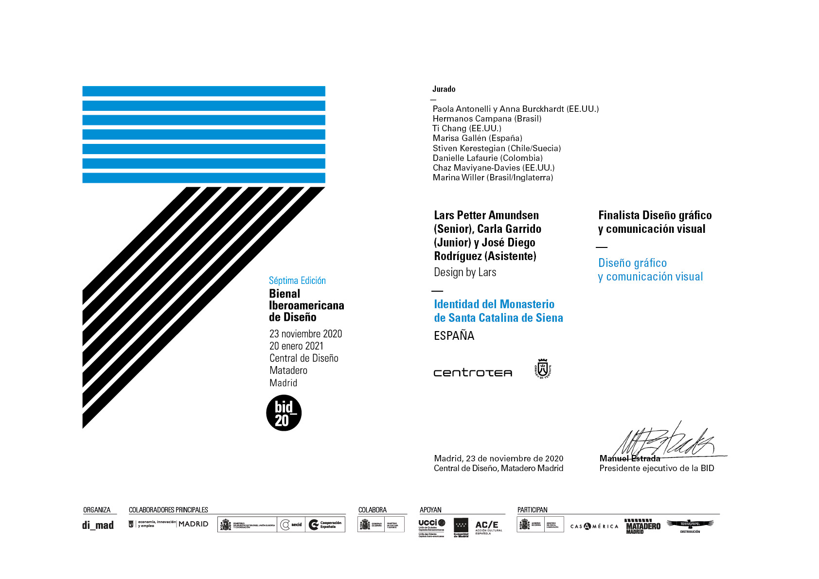
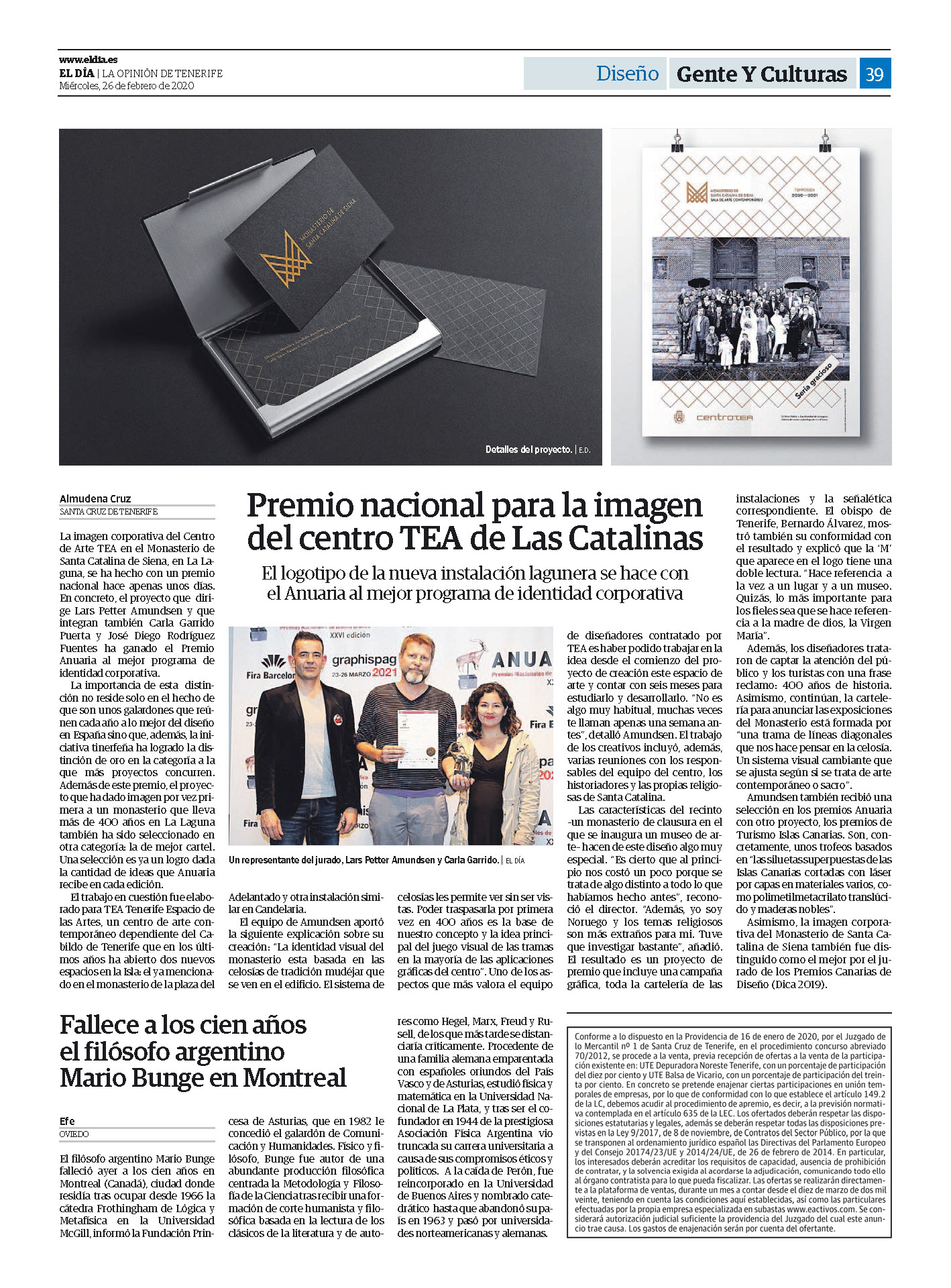
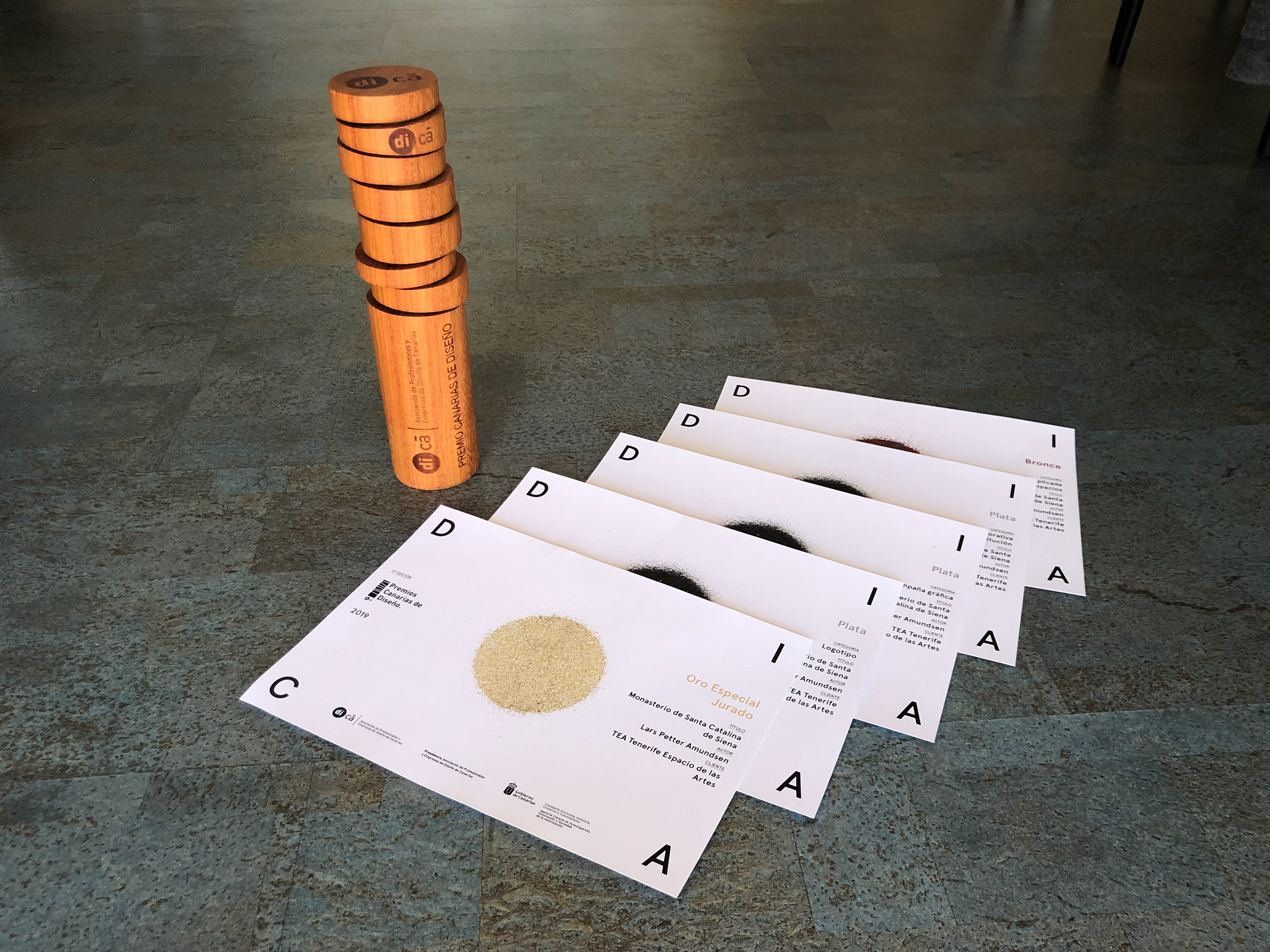
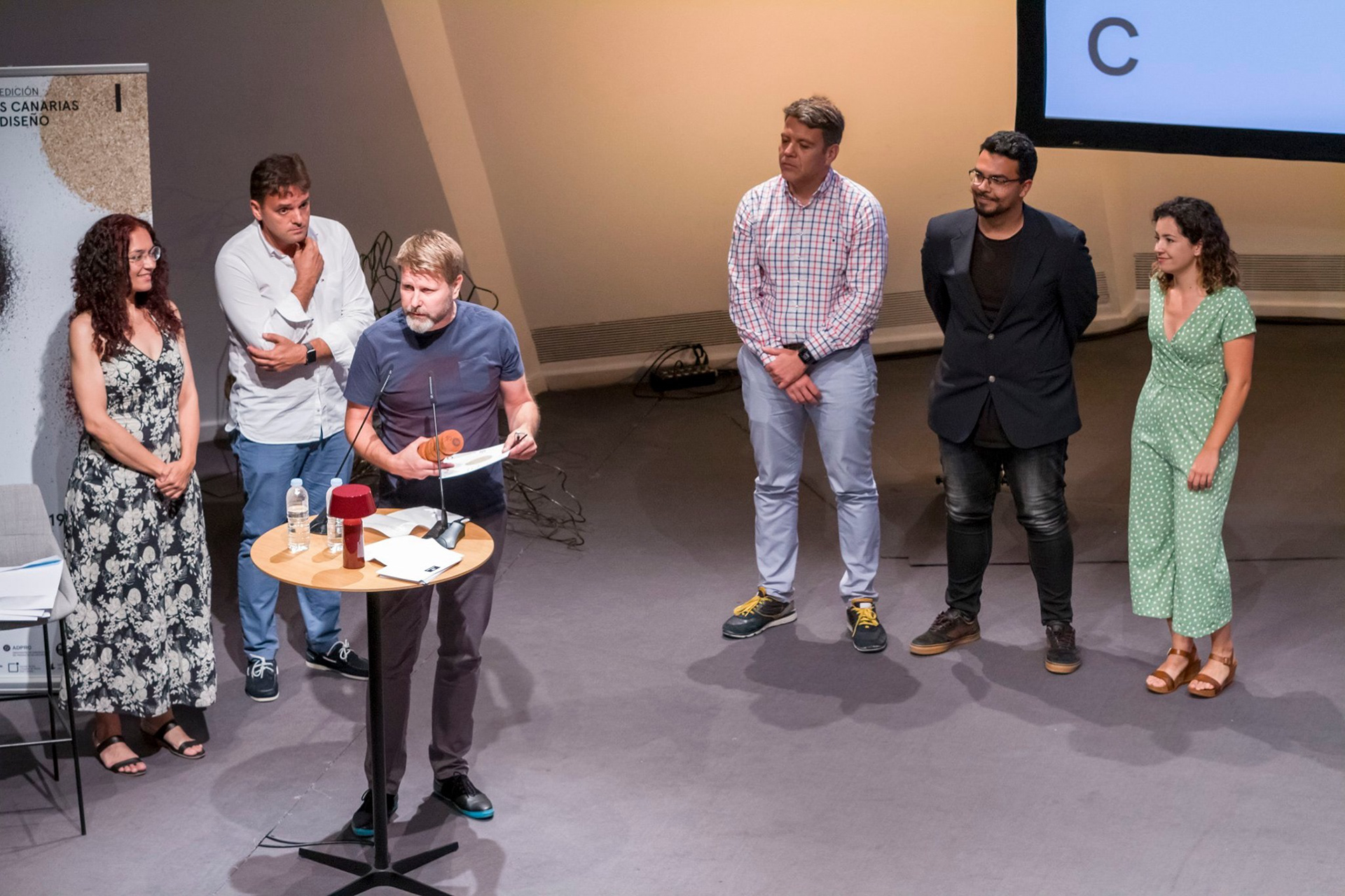
Art Direction & Design: Lars P Amundsen
Assistant designers: Carla Garrido & José Diego Rodríguez
Typeface: Monokrom Skriftforlag
Client: TEA Tenerife Espacio de las Artes